Sync
2026
AI Powered Sales Management Tool
Sync is a web-based sales workspace that brings sales analytics, team performance, product inventory, customer insights, communication and lead management into one dashboard. It is built for small and mid-sized sales teams who need to track revenue, manage relationships and act on leads without switching between tools. A built-in AI assistant, Ask AI Zolo, is available on every screen.

Define
Problem Statement
Sales teams usually work across disconnected tools: a spreadsheet for revenue, a CRM for leads, an email client for conversations and a separate inventory system. This causes several problems:
Scattered context. To prepare a quote, a rep has to look in several places for the contact, past emails, deal value and stock availability.
Slow decisions. Managers can't see revenue, team performance and pipeline health together, so problems surface late.
Data-heavy interfaces. Most CRMs are dense and table-driven, which makes them tiring to scan and easy to ignore.
Lost follow-ups. Tasks, reminders and notes sit apart from the lead or contact they belong to.
Ideate
Information Architecture

Design
UI Layouts
Design Highlights
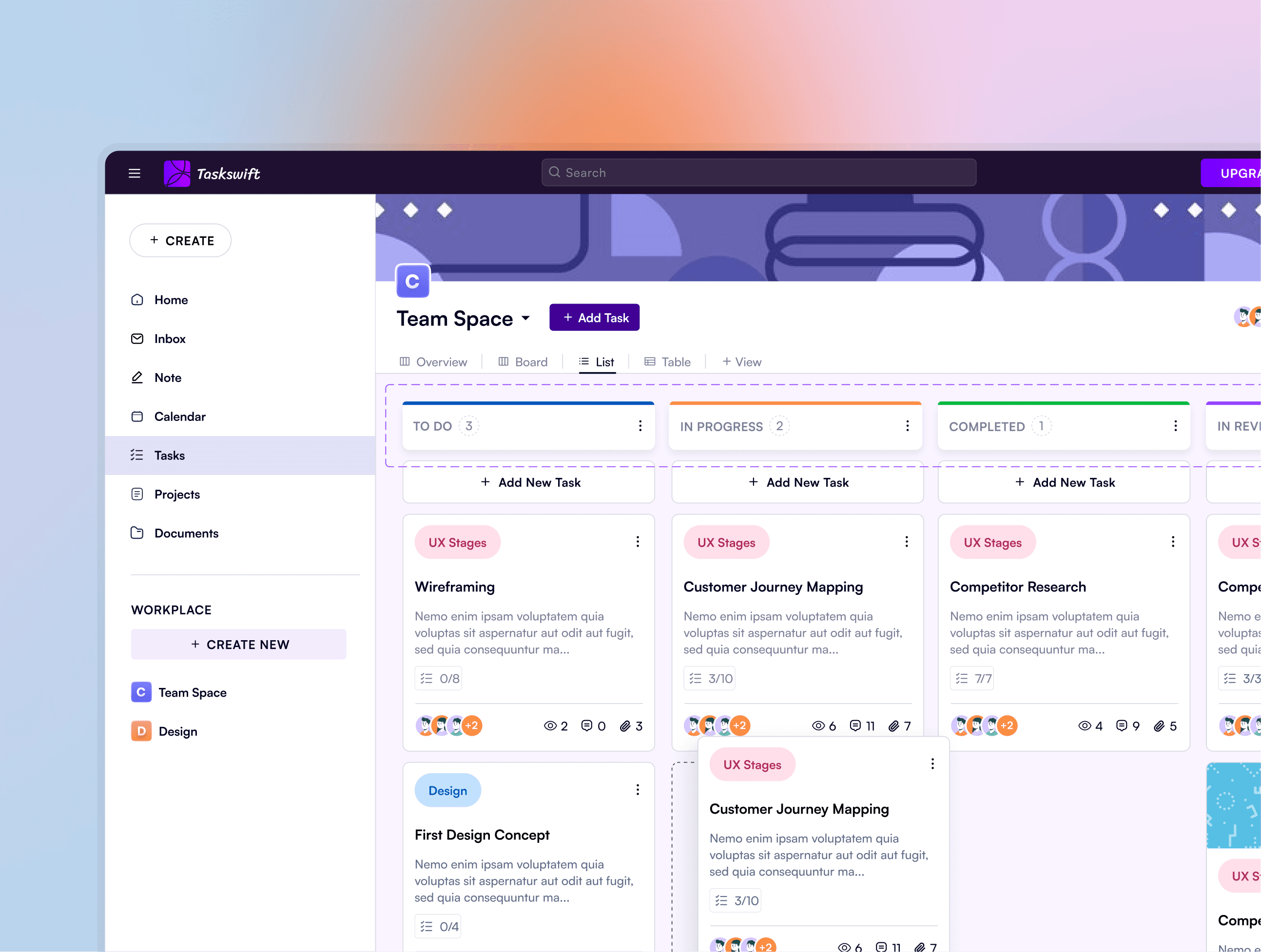
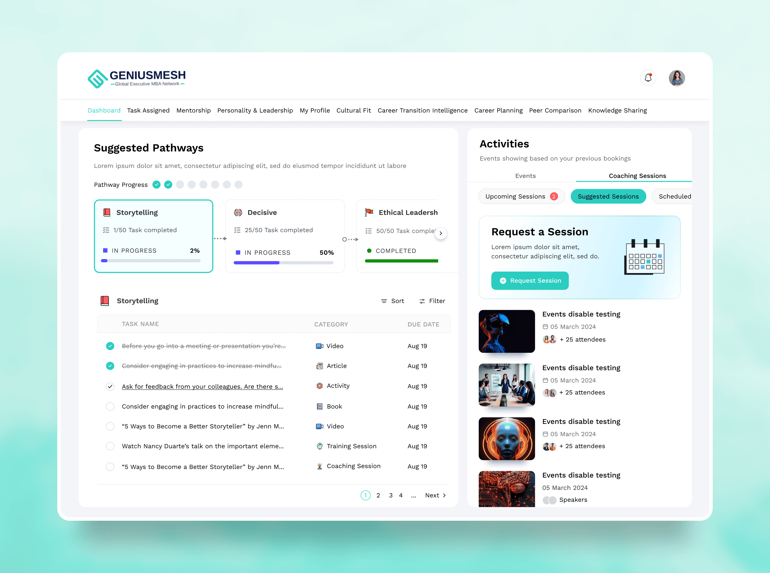
Consistent page structure: title, subtitle, Export and Settings actions, then a card grid.
Colour is used for status (green, red, blue), so meaning is clear without reading labels.
Progressive disclosure through side panels, collapsible sections (Deals, Tickets, Attachments) and tabs (Activity, Notes, Emails, Calls).


Color & Font

Wireframes
Refining the dashboard experience

Lessons
Designing for clarity, confidence, and everyday financial workflows
This project reinforced how strongly financial confidence is shaped by interface clarity rather than financial complexity itself. Throughout the redesign, I explored how hierarchy, spacing, and contextual feedback could reduce uncertainty during everyday financial tasks. One of the biggest learnings was recognizing how small interface decisions — such as grouping, transaction context, and action placement — significantly influenced how users interpreted information and navigated the product.
Lessons
Designing for clarity, confidence, and everyday financial workflows
This project reinforced how strongly financial confidence is shaped by interface clarity rather than financial complexity itself. Throughout the redesign, I explored how hierarchy, spacing, and contextual feedback could reduce uncertainty during everyday financial tasks. One of the biggest learnings was recognizing how small interface decisions — such as grouping, transaction context, and action placement — significantly influenced how users interpreted information and navigated the product.