QuoraAI
2025
QuoraAI: AI Blog Generator
Designing approval workflows, budget controls, and review processes to support growing organizations.

Overview
What is QuoraAI?
QuoraAI is a web app that helps people write blog posts with AI. Someone gives it a topic and a few keywords, and the app suggests titles, builds an outline, and writes a full article. The user can edit the article, add a header image, share it with teammates and export it. The app also covers related writing jobs: essays, blog ideas and blog images.
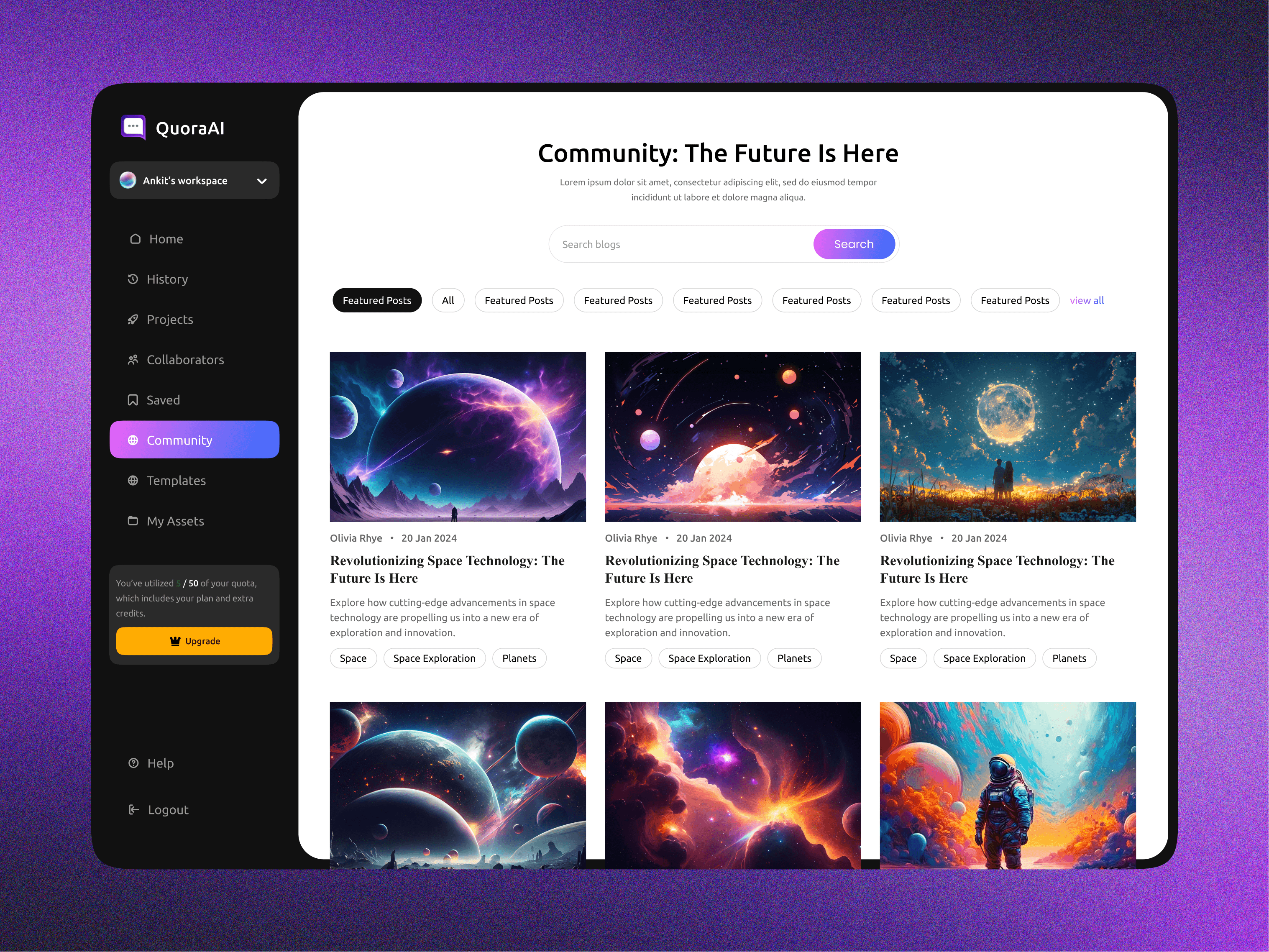
Each person gets a workspace where work is grouped into projects. Teammates can collaborate on those projects. There is also a template library for quick starts and a community feed of published posts. Usage is tied to a quota (for example, 5 of 50 blogs used), with an upgrade prompt for more.
Define
Problem Statement
Writing a good blog post takes a lot of time. People stare at a blank page, struggle to pick a topic angle or title, and spend hours on research and structure before they write a word. Many AI writing tools make this worse in other ways. They produce a wall of text with little control, so the result sounds generic, ignores search optimisation and can't be steered. Drafts end up scattered across tools, teammates can't easily work on the same piece, and it is unclear how much of the plan has been used.
Solution
QuoraAI turns blog writing into a guided, step-by-step flow with the user in control at each stage:
Guided generation: A three-step flow (Add details, Select title, Generate outline) gets the user from a rough idea to a full post. They set the topic, keywords, background facts, writing style, word count, language and number of variations. They then pick from AI-suggested titles and edit the outline before the article is written.
Clear progress: Loading screens say what the AI is doing, such as researching keywords and generating SEO-optimised titles, so waiting feels purposeful.
One place for all content: The dashboard has quick-start cards for blogs, essays, ideas and images. Below them sit recent documents and projects, plus a history panel for jumping back into past work.
A full editor: After generation, the user edits in a rich-text editor with formatting tools, adds an image, shares the post to social channels, invites collaborators and exports it.
Faster starts and inspiration: Templates cover blogs, emails, social media and website copy, and the community feed shows what others have published.
Teamwork and limits that are easy to see: Projects group related posts, show who is working on them and support sharing. A quota meter and upgrade card are always visible in the sidebar.
Design
UI Screens




Reflection
Designing for operational complexity
This project highlighted the difference between designing for individuals and designing for organizations. While expense tracking focuses on visibility, financial operations depend on coordination between people, teams, and processes.
The most impactful improvements came from making responsibilities, approval states, and next steps visible throughout the workflow. By reducing ambiguity and creating clearer pathways through the system, the experience became easier to navigate while supporting significantly more complex organizational needs.
This feels much closer to the style and depth of your Polaris case study while still being noticeably shorter.
Reflection
Designing for operational complexity
This project highlighted the difference between designing for individuals and designing for organizations. While expense tracking focuses on visibility, financial operations depend on coordination between people, teams, and processes.
The most impactful improvements came from making responsibilities, approval states, and next steps visible throughout the workflow. By reducing ambiguity and creating clearer pathways through the system, the experience became easier to navigate while supporting significantly more complex organizational needs.
This feels much closer to the style and depth of your Polaris case study while still being noticeably shorter.
Reflection
Designing for operational complexity
This project highlighted the difference between designing for individuals and designing for organizations. While expense tracking focuses on visibility, financial operations depend on coordination between people, teams, and processes.
The most impactful improvements came from making responsibilities, approval states, and next steps visible throughout the workflow. By reducing ambiguity and creating clearer pathways through the system, the experience became easier to navigate while supporting significantly more complex organizational needs.
This feels much closer to the style and depth of your Polaris case study while still being noticeably shorter.